One of the biggest flubs that product teams make is confusing designs that look great with designs that actually work well. It’s a simple mistake, but it can have grave consequences: If your product doesn’t work well, no one will even care how it looks, after all.
The best way I’ve found to get around this confusion is a technique called story-centered design. The idea is to create a series of narrative use-cases for your product that illustrate every step in the user’s journey through it. I’ve used this technique with dozens of startups and it always helps teams move past the surface visual details to make better decisions on what really matters: how their product finally works.
Designs shouldn’t be blueprints
I’ve observed that teams often like to walk through UI designs as they would a blueprint – showing where each element belongs on the plan. Each screen shows how the product might look in a different situation, but the screens are not connected in any way. The problem is that when designs are presented this way, you’re only building an understanding of how the product looks. You’re not focusing on how the product works, and you’re not simulating how customers interact with it. So when teams critique designs as blueprints, it severely limits their ability to reason through the interactivity of the product.
The best product designers practice story-centered design. They begin by crafting stories that show how customers interact with a product, and only after they’ve accomplished that do they design screens as a way to tell that story of interaction.
The process of designing by story
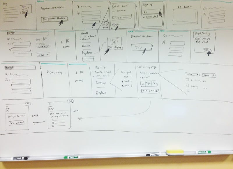
In story-centered design, teams critique work by looking at dozens of sequential mockups that function like frames in a filmstrip (see the photo below). Designers present every sentence the customer reads, every action they take, and every screen that system generates in response. The designs follow a customer from an initial trigger all the way through completing a goal, and they show how the design supports every step in that flow. I’ve coached many startups through story-centered design exercises and seen these techniques work for mobile apps, marketing websites, analytics dashboards, enterprise IT and beyond.
For engineers, this should sound familiar. The core of story-centered design is the same as test-driven development. Only instead of writing tests to exercise our code, we’re creating stories to exercise our designs. Just like test-driven development, story-centered design can have an incredible impact on a team’s execution speed and product quality.
Here’s an actual example of what I’m talking about.

Storytelling step-by-step
- Whiteboard stories Start design projects by whiteboarding the customer interaction with your team. Draw a bunch of 1-foot sized boxes on your board, then create a story by filling in the boxes with each small interaction the customer makes with your product. Draft critical pieces of copy together. Show each place users will tap or click (again, like the image above). Creating it will take a while, but once the team agrees to the story the rest of the design process will go much faster, with less churn and waste.
- Change your tools Most design tools were made for creating posters or books, so they don’t give you the tools needed to design interaction stories with dozens of frames. So ditch Photoshop early on, and pick up a tool like Keynote, OmniGraffle, or Fireworks that support multiple pages and helps you focus on designing the end-to-end flow.
- Never critique single screens It’s a big red flag if someone sends just one or two mockups for review. Make sure your team is always reviewing full stories. If you’re presenting in-person, print each screen on paper and lay them out across the room. This way everyone can see both the overview and the details on each screen. If you need to send designs over email, record a quick screencast video that shows how the screens come together into a story.
Why story-centered design works so well
It simulates the user experience Story-centered design forces us to ride along with customers through every single step. That gives the entire team (designers, engineers, CEO) a system for making design decisions based on how people will actually experience the product.
Teams spot problems earlier Because stories add a time dimension, they highlight all sorts of design mistakes that teams often miss when viewing their product as just a bunch of screens. Stories make it easier to notice when prompts don’t set the right expectations. UI flows that have unnecessary steps and dead-ends get noticed and fixed more quickly. All these small details add up to better usability and user engagement.
It clarifies design goals up-front When teams start by designing stories, it forces everyone to come to agreement on the design goals before working out the details. That’s helpful because after designers have spent hours on detailed UI mockups, critique will be narrowly focused on whether the designs accomplish pre-set and understood goals.
It’s science! Well, sort of. Thinking through how a customer goes from initial trigger (like an email or push notification) all the way through to finishing a goal maps fairly well to BJ Fogg’s Behavior Model of Triggers, Motivations, and Ability. Stories make it easier to check that you have all these elements in place to encourage user behavior.
It speeds up everything else Stories can often be reused by other parts of the team. Mockups created for showing a story can be repurposed into a quick clickable-prototype for user studies. The same story can be used to build a funnel analysis, which helps us find out whether users are making it through that story in the live product. And the QA team can run through key stories to validate each new release.
This article was originally published on GigaOm